Moving average
Some weeks ago, I shared how we leverage ARIS MashZone to measure and visualise the growth of ARIS Community. An important part of the belonging performance dashboard is a curve showing the total number of registered users. The curve looks like the one shown in the following picture:
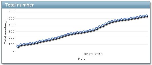
The problem with such a curve is that you can’t really see if the growth accelerates or slows down. Of course you can see some slightly increases and decreases in the slope, but it is hard to judge whether that are significant changes or not.
A better visualisation of the same data would be to show how many people signed up per day instead of showing the total numbers of all registered users at the end of each day. Such a curve doesn’t solve the problem yet for ARIS Community member count, because on weekends fewer people sign-up than during working days. Therefore, I’m only interested in the average number of new community members during the last 7 days. In the end, I want to have the following visualisation:
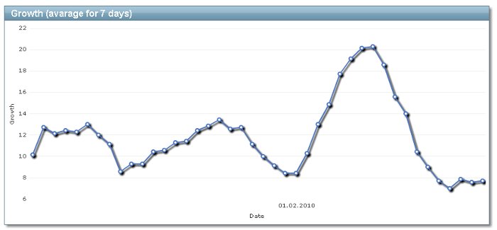
It is the same data as in the first picture, but I think it delivers way more meaning. Creating such a “moving average” curve using ARIS MashZone took me some thinking and I was only able to solve it due to the great support of our ARIS MashZone experts Stephan and Martin. I think the solution I found might be of interest for other ARIS MashZone users, so I share it here with you.
Example MashApp and sample data
Just reading what I did might be interesting, but I think way more interesting is if you could try it yourself. Therefore, grab your free copy of ARIS MashZone and import this MashApp to view the curves shown in the pictures above.
The curves above are based on some data, which you can view here in Google Docs:
http://spreadsheets.google.com/pub?key=tgWjdHndmaUQkowBeLRNtag&single=true&gid=0&output=html
If you change the last part of the URL above from “html” to “csv”, the data is returned to your browser as CSV file, which you can directly pull in to ARIS MashZone, too. If I change my sample data in Google Docs, your MashApp would update, too.
Operating on several rows to create a moving average
If you take a look at the sample data, you can see it only contains 2 columns:
- date
- total number at that day
The data set doesn’t contain the number of new registrations per day. Unfortunately, we can’t calculate them easily, because ARIS MashZone operates on single rows, but not on several rows. That means, it is impossible to say "take the current value and subtract the value from 7 days before".
To overcome this problem, we need to perform a little trick, which is shown in the following picture:
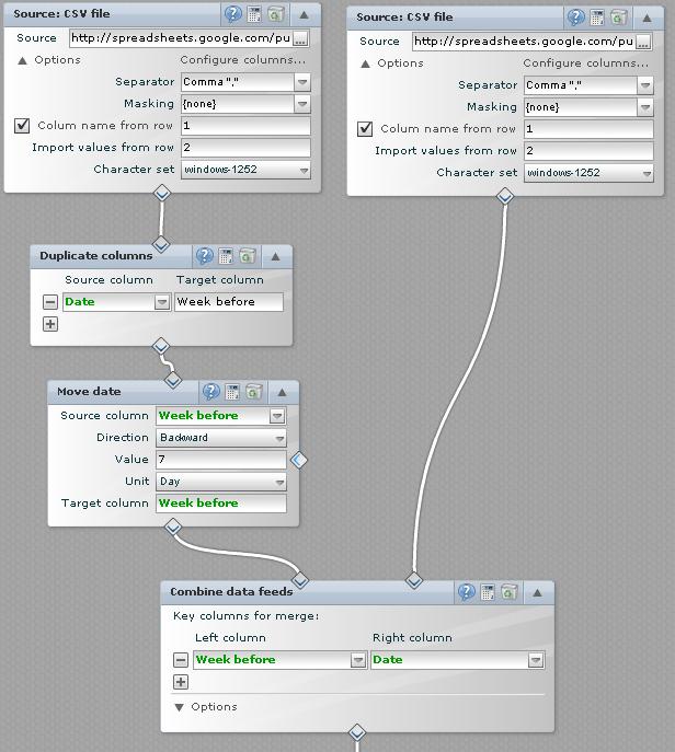
First, I import the same data twice into ARIS MashZone’s feed editor. Now, I duplicate the date column in the left data set. Afterwards, I use the “Move date” operator to change the date value of the duplicated date column by 7 days back to the past. I use 7 days, because I’m interested in the moving average for the past 7 days. If you are just interested in the delta between the day and the day before, you would move the date by 1 day instead.
Finally, I join both data feeds using the changed date from the left data set and the original date from the right data set. The intermediate result looks as follows:
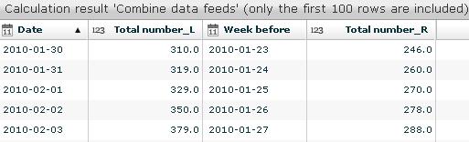
The column "Total number_L" shows the total number at the given day. The other column "Total number_R" shows the total number 7 days before. Now, it is easy to calculate the difference, because I got all values I need in a single data row.

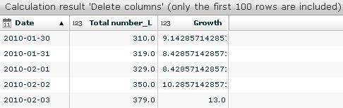
First, I remove all rows, which don’t contain data for the column "Total number_R", because for the first 7 data entries, there are no values in the past.
Afterwards, I do the subtraction and divide the result by 7, because the delta is covering 7 days. Finally, I delete some columns, which I don’t need in my MashApp, before I create the final output. The result looks as follows:
Visualising this data set using a MashApp is straight-forward, so I don’t go through the steps involved. Instead, make sure to download my MashApp to test it on your own. For example, you could extend my MashApp with a control to change the length of the moving average. Would be great if someone shares screenshots how to do that!