Welcome back to the blog post series about the implementation of the ARIS Aware dashboard for application portfolio management. The topic of the article before was the creation of the data feeds which prepare the data for the charts. In this article I’ll describe how the charts and the enclosing dashboard was implemented. Just like in the posts before, I’ll use the application portfolio chart as an example. The other charts were made analogously.
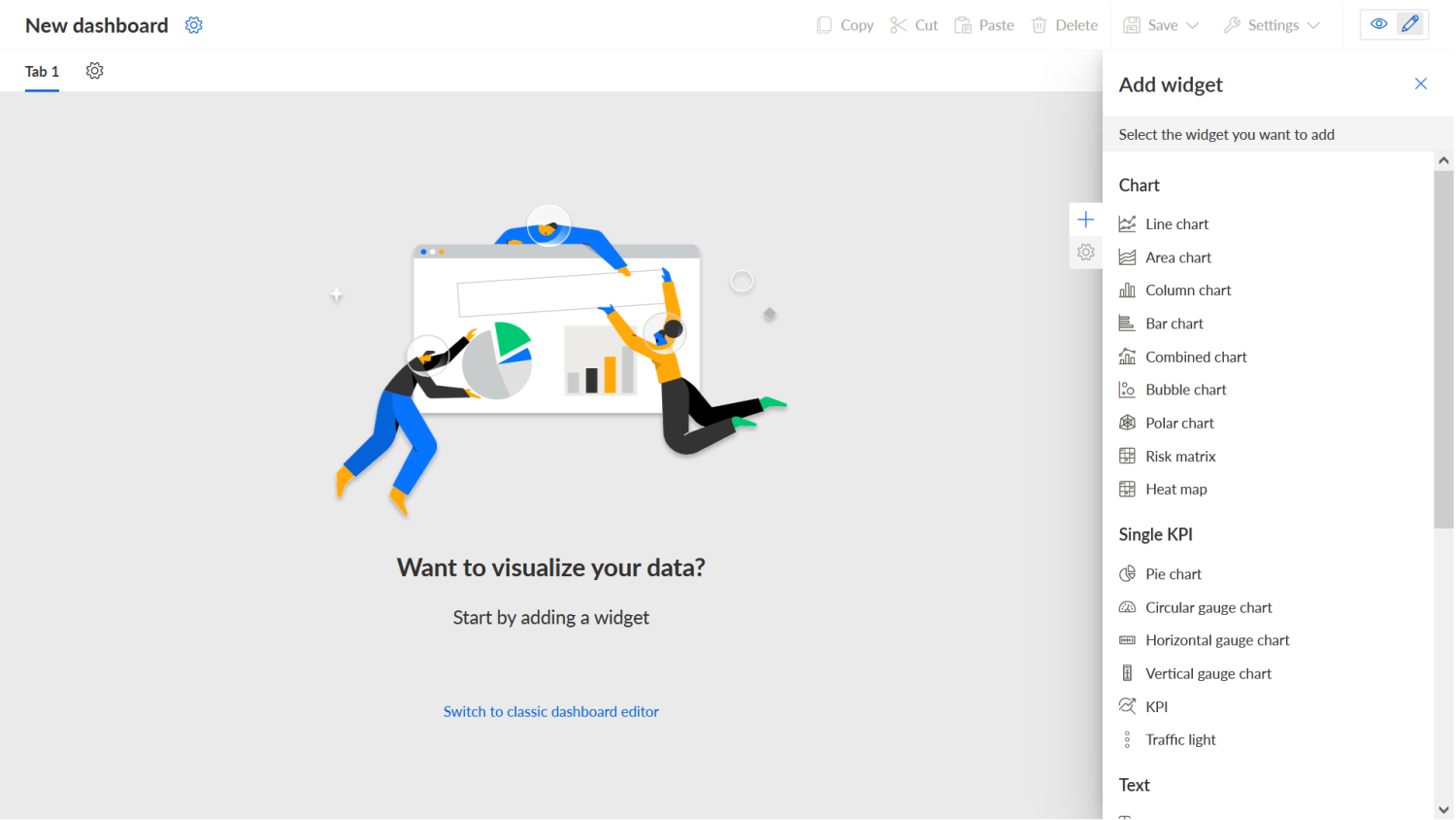
The first thing we did was to create a new dashboard which looked like this:
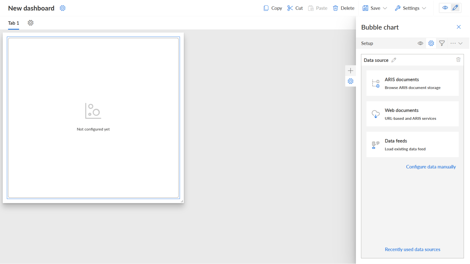
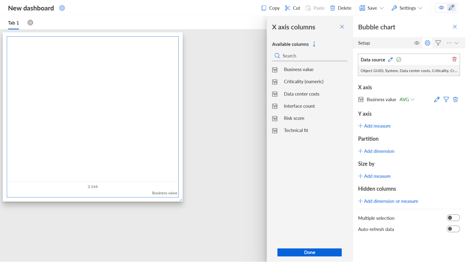
Then we added a bubble chart which should become the application portfolio:
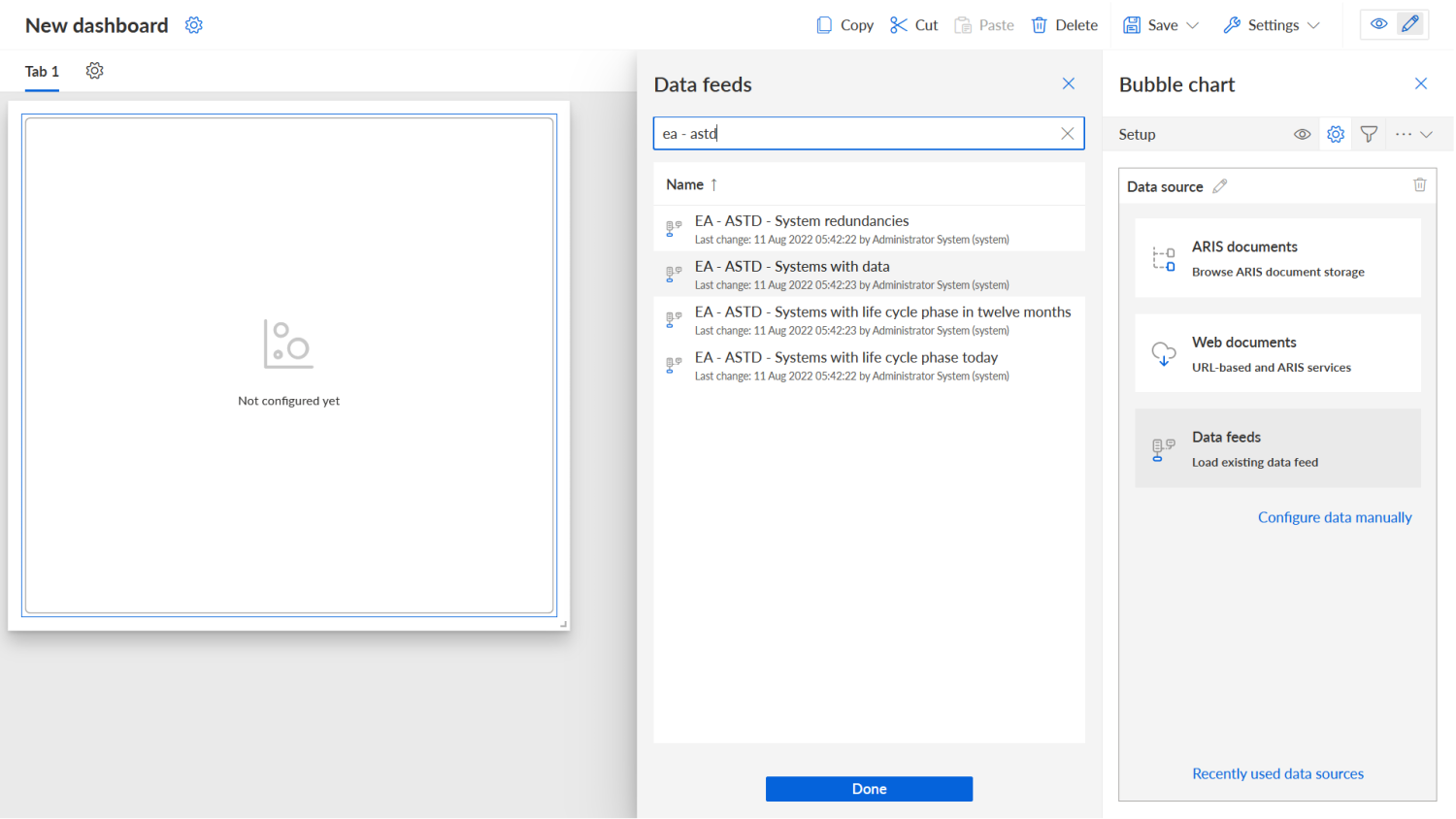
This bubble chart we had to connect to the data feed that provides the list of applications with their properties. Here you can see how the data feed is selected:
The result of this selection looked pretty boring:

Before we could fill this with life, we had to make sure that only applications with all required KPIs will be shown in the chart. For this we added a filter to the data source configuration of the chart which removes applications where one or more of the KPIs Business Value, Technical Fit and Data Center Costs are missing:
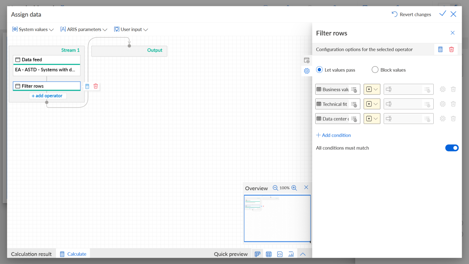
Filtering applications with non-existent Business Value and Technical Fit KPIs is a bit overzealous because the bubble chart will not display those anyways, but the Data Center Costs filter is actually useful because otherwise there would be bubbles in the chart with a made-up size. And those we did not want.
OK, back to configuring the chart itself. We started with the dimensions of the chart that can be defined in its Setup panel (the one with the cog wheel): X axis, Y axis, and bubble size. This is what it looked like after setting the X axis to Business Value:
Still not very interesting. This is what it looked like after setting the other dimensions on this panel as well as the partitioning:
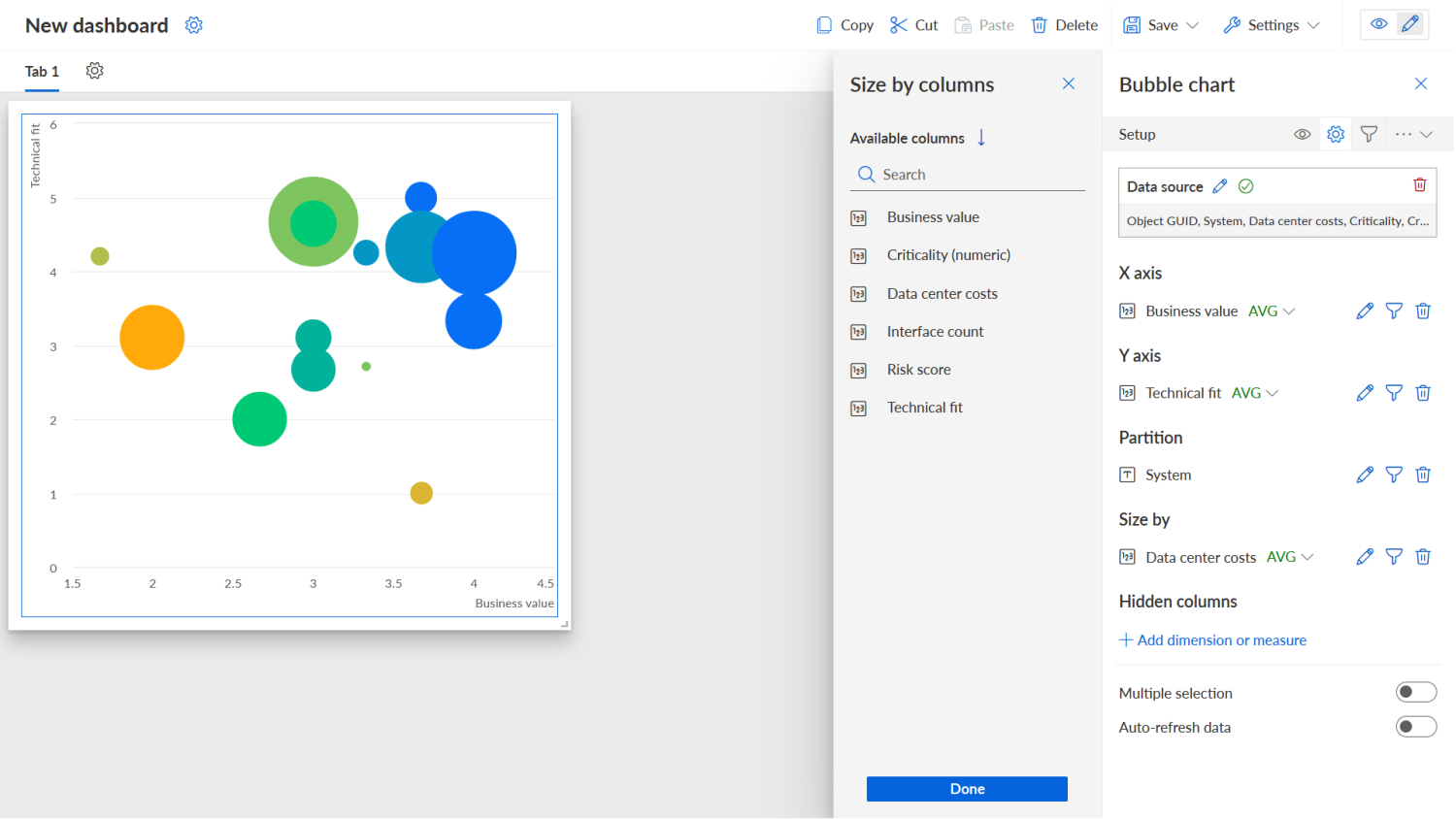
Now that looks a lot better! But there was still a lot to do.
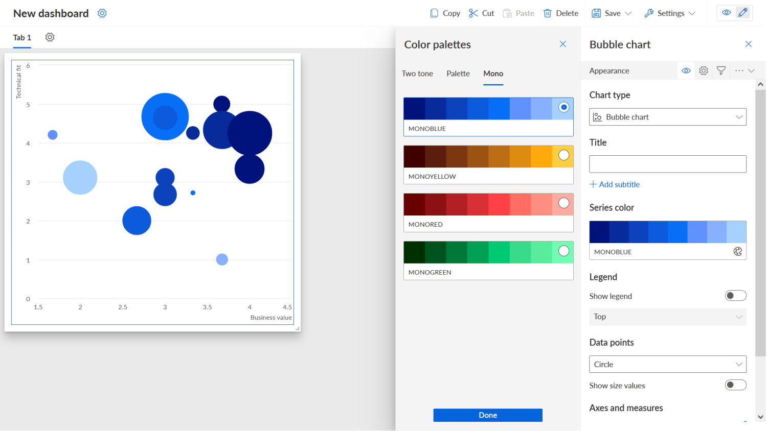
For one, we needed to choose a more neutral color palette. Some (but not all) of the applications have a risk score which we want to show through the bubble color. If the ones that don’t have a risk score were already so colorful, the ones with the risk score colors would be hard to discern.
The color palette can be set in the Appearance tab (the one with the eye symbol). We chose Monoblue, a palette with blue hues only:
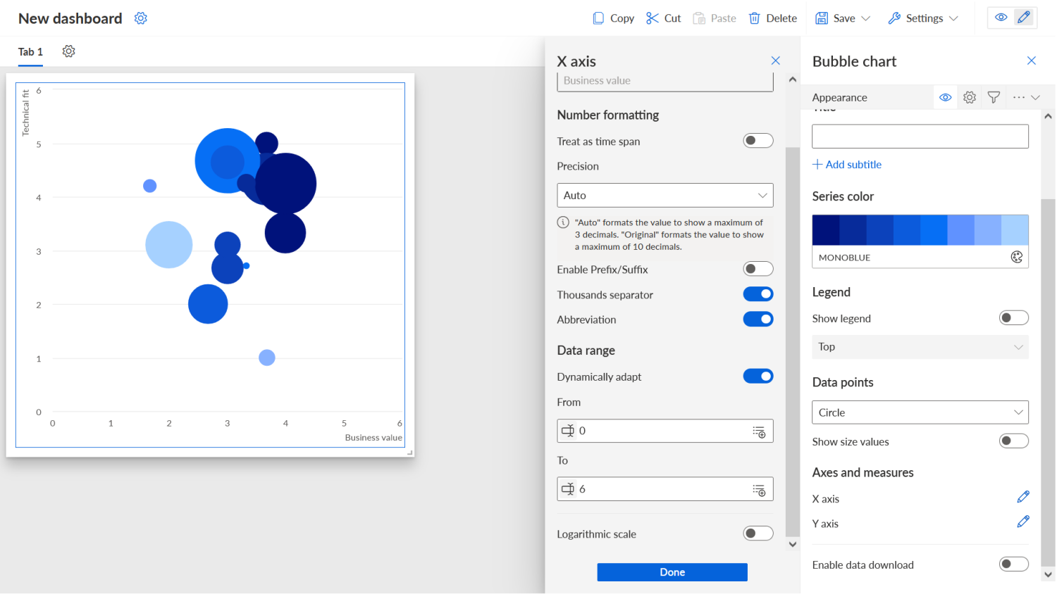
On the Appearance tab you can, among other things, also set the ranges for the axes. As you can see in the screenshot above, the X and Y axes have different ranges and we wanted them to be uniform to get a nice, symmetric portfolio view. So we set both axes to a range between 0 and 6:
Speaking of portfolio view, what was still missing was an indication of the four quadrants which are usually part of such diagrams. It’s possible to define background colors in a bubble chart for an axis on the Thresholds tab. For the X axis we set the background to dark grey from 0 to 3 and to light grey from 3 to 6:
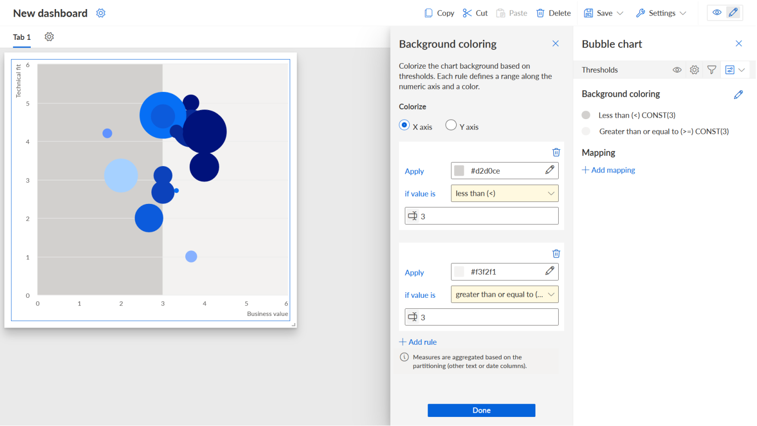
And now the sad part came. It was and currently is not possible to add a coloring for the second axis or define colors for four quadrants directly. You also cannot specify investment/divestment suggestions for such quadrants. So, our nice plan for a four-quadrant portfolio chart was thwarted! We currently have to make do with two sections (low business value and high business value) and have to rely on the people looking at the chart to know that applications on the lower left are ones they might want to get rid of, applications in the upper right ones that they might want to invest in, and so on. I still hope that the chart type is extended in the future to support quadrants but for now it is what it is.
With this out of the way, let’s look again at something that is supported: Colorization of the bubbles with color codes coming through our data feed. This colorization can also be configured on the Thresholds tab below the section Mapping. And this is pretty straightforward. You add a mapping and then choose the column with the color codes from the data feed. In our data feed we had these color codes in the column Risk color if you remember from the last blog post. This is what the result of this setting was:
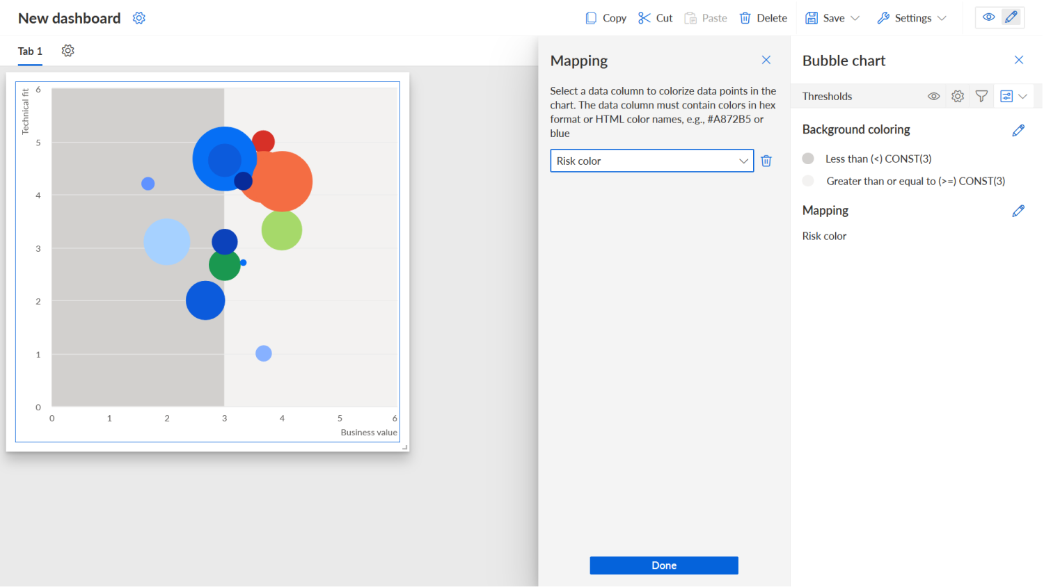
Some of the applications have a risk score and are shown in red, orange, or green. The others retain the blue color they got from the color palette. Nice! This brightened the mood after the setback with the quadrants.
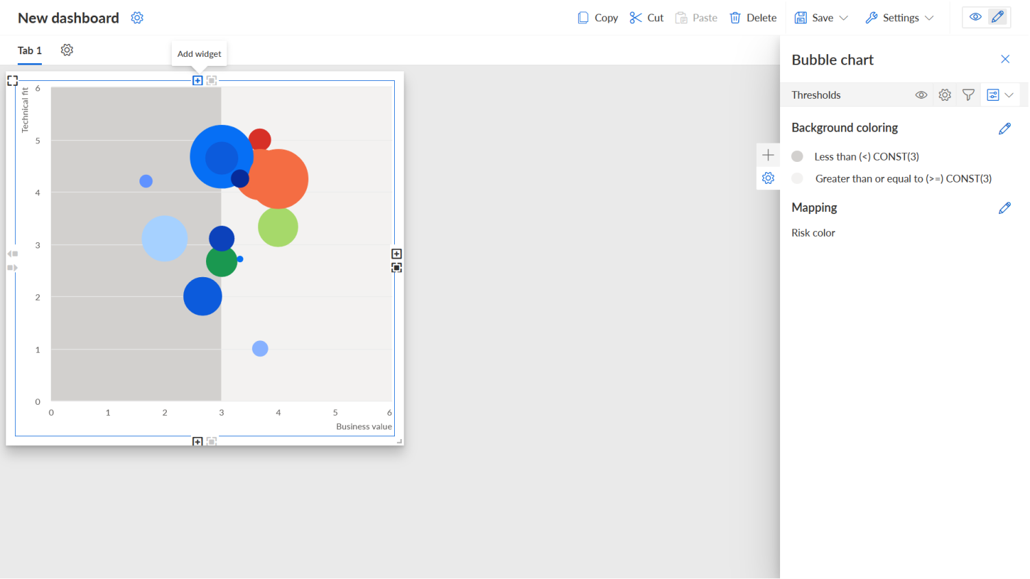
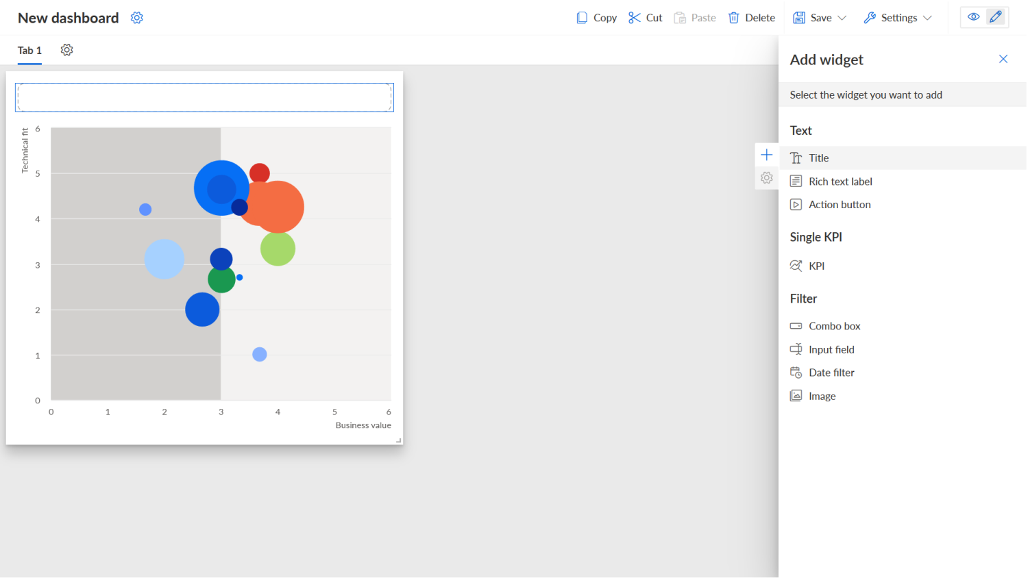
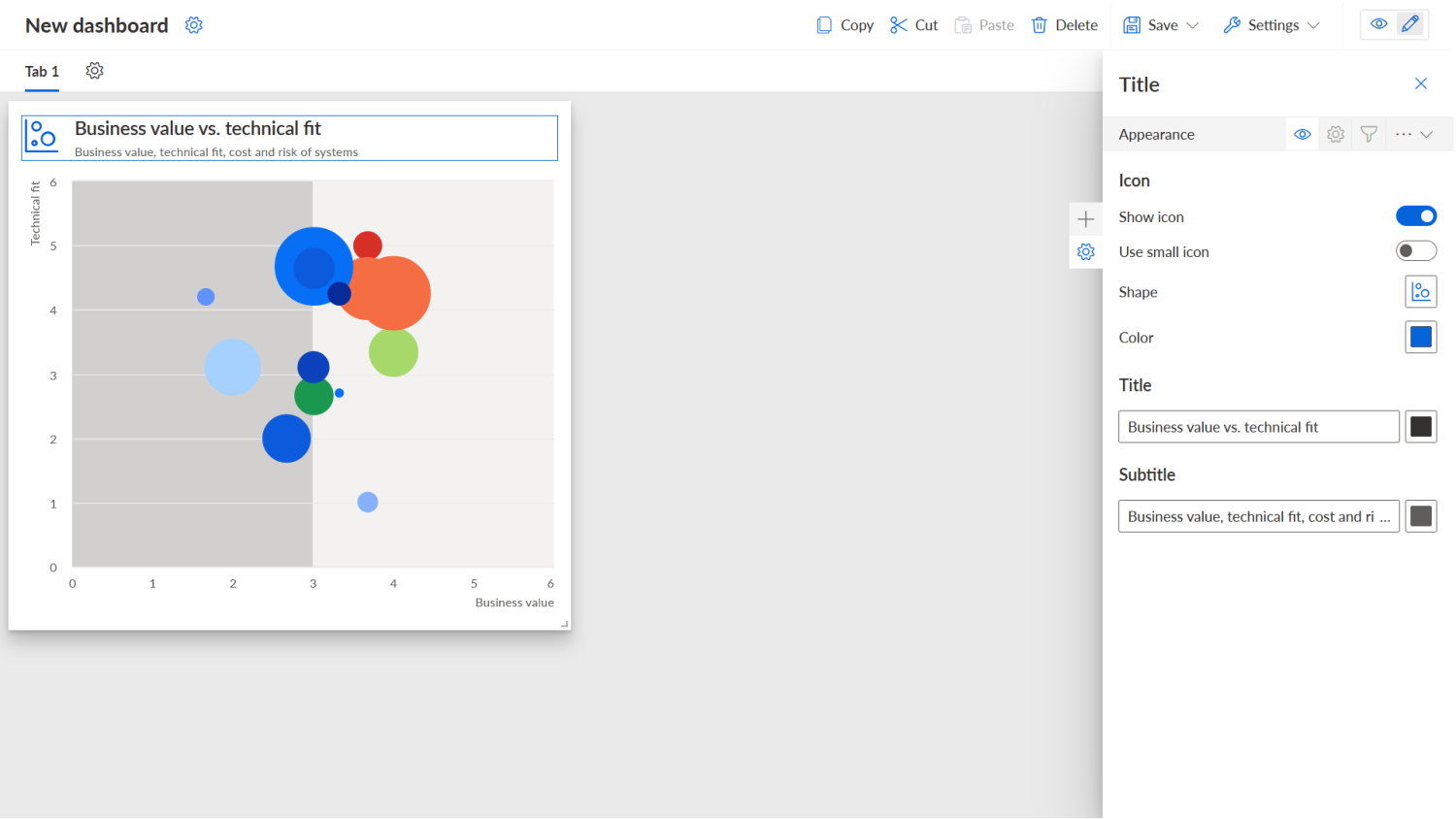
In order to complete the chart, we then just needed to add a title. This was done by clicking on Add widget…
…choosing Title…
…and then specifying the chart title, subtitle, and icon:
And that’s it! The rest of the charts are created in a similar way as the procedure described above. The result was the nice dashboard you saw at the beginning of this blog series.
Now that we had the dashboard, we still needed to integrate it into the ARIS Connect portal. How this was done I’ll explain in the next and final article of this series. Thanks for reading and see you there!