The content overviews, formerly known as overview fact sheets, have been redesigned to simplify and modernize the entry point to detailed process information in ARIS 10 SR22.
And now, with some examples, I'd like to demonstrate you this new design.
Reminder: The purpose of the content overviews is to give a brief, simple-to-understand summary and overview of pertinent process content.
Let's examine the new design in more detail:
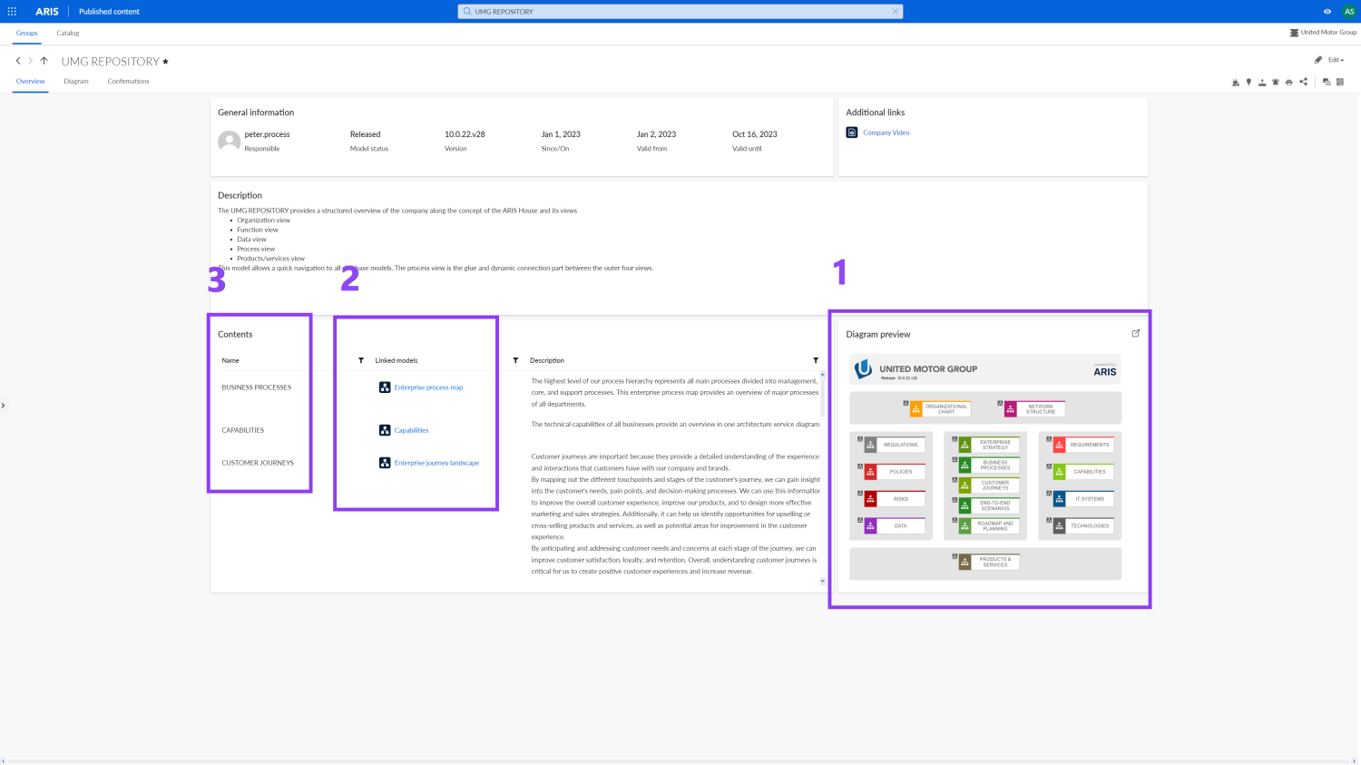
It is visible how much the appearance has changed even at first sight. The "tile" approach that you are already familiar with from the home page is now used in the content overviews.
For visual orientation, a non-clickable diagram preview is shown (1). The diagram in the diagram preview just provides visual guidance. But you can click here to open the diagram in the respective diagram tab.
It is also easy to quickly navigate to the connected, underlying, and more comprehensive diagrams. (2).
But it's also quite simple to make a quick jump to other content overviews. (3)
BTW: Subtitles can be added to or changed for all tiles. To do this, all you need to do is get in touch with the ARIS (portal) administrator and request adjustments to the tile's name or description.
If predecessor and successor processes exist, they will be displayed on the "related diagrams" tile.
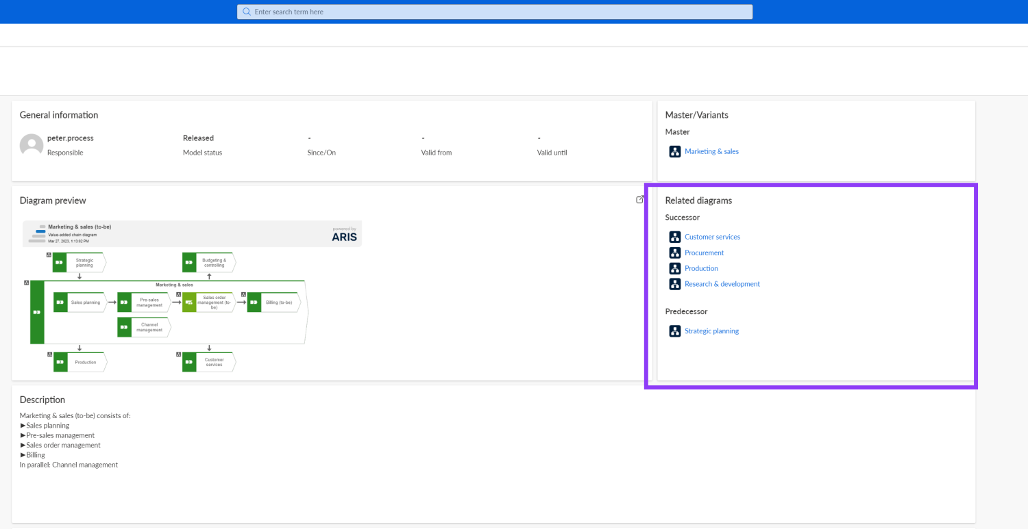
This makes navigation possible, even for BPMN processes.
As long as the contents are maintained, additional tiles such as involved roles and responsibilities, input and output data and documents, as well as supporting systems, can also be displayed.
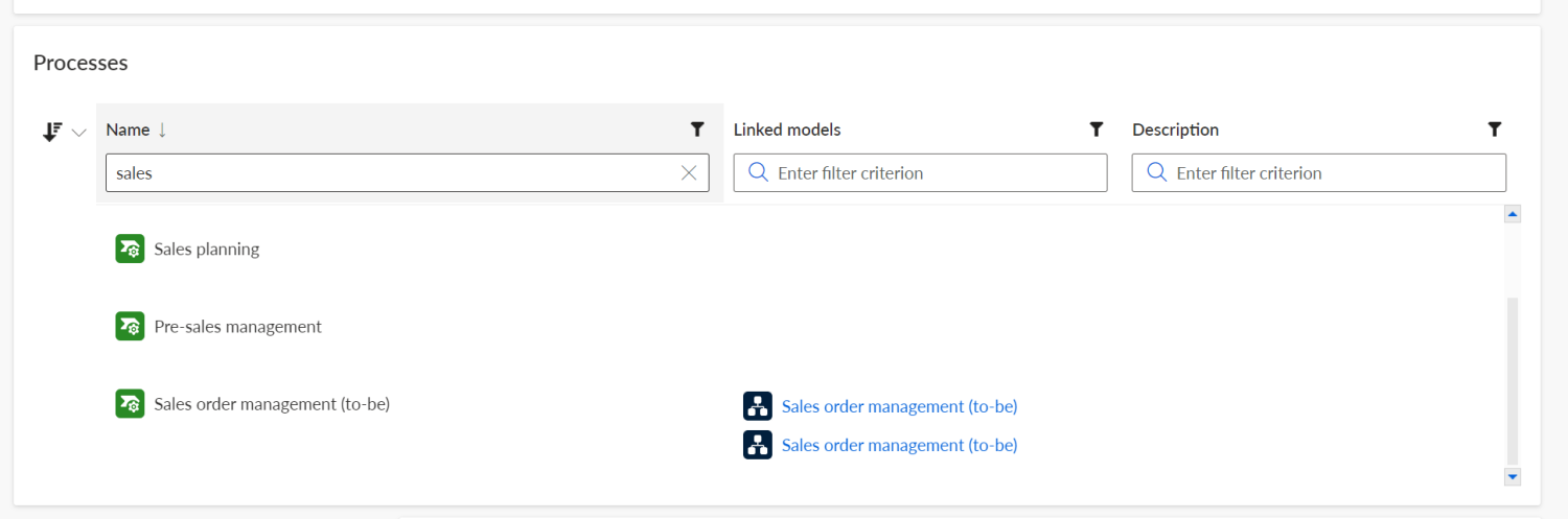
Another view on the content overview has been reworked. The new standard table tile may be sorted and filtered now. You can thereby reduce the number of entries and easier find information or particular keywords.
Of course, a wide variety of alternative model types, including BPMN, organizational charts, eERM models, and Application System type diagrams, can also be shown in the content overviews.
However, the edit mode for the content overview page requires additional licensing to a viewer license.
I hope you liked this sneak preview and that I was able to quickly introduce this new feature to you. If you would like to see this new feature in action click here.
Please read the ARIS release post and/or sign up for our forthcoming webinar to learn more about the latest release. During the Q&A session of the webinar, you will also get the chance to ask the product managers your specific questions.

Looks great!!
I am wondering a few things:
- Will it be possible to add nice icons in front of the headers, or is this functionality removed?
- When migrating towards SR22: what hapens with the current fact sheets? Do I need to rebuild them or is it's structure still there in SR22?

In reply to Looks great!! by l.vanderzanden
Hi Leon,
Happy to hear that you like it. Curently there is not possible to add icons in front of the headers.
Regarding to your second question about migration: it depends what your current settings are (xml or self service). In case of xml nothing will change, in the self service case you can decide if you like to migrate the new facthseets or not.
Greetings.
In reply to Hi Leon, by kiril.popov


Thu, 07/27/2023 - 13:27
In reply to Since yeserday we are running by l.vanderzanden
Dear Leon,
When you click Annuleren/Cancel, and instead edit your modification set you can manually switch to the new grid-based layout with the Overview via the option System (=new grid-based layout).
In the free Software AG LP: ARIS 10.0 SR22 Technical Product Release Session you can watch at around 0:57 in the recording which matches to slide #11.
Cheers
Runé
In reply to Dear Leon, by rbe
In the meanwhile I recieved the solution for a step by step migration of the fact sheets:
Step-by-Step description:
- Edit your modification set.
- cancel the pop-up window to migrate
- Select Fact Sheet tab
- for example for .process model types like EPC, search for "process"
- Edit that
- Select edit overview tab
- Select "System" layout (that means "Grid based factsheet" like in SR22)
- Refresh the page
- You will see the new layout and can adjust this now
I have an other question: will it still be possible to add lists of elements, like the information from a function allocation diagram that is assigned with the value added chain diagram? In the SR21 (and before) I used within the self serve all kinds of 'complex' dependancys to produce a rich set of information towards the enduser. The configuration I have prepared in the content type set.
Fri, 07/28/2023 - 10:43
In reply to I have an other question: by l.vanderzanden
For me is your question a bit too abstract, but I am not really an ARIS configuration expert. I would need more context or examples of what you'd like to achieve.
And in general, I'd like to recommend you starting a new post with your topic to give everyone on the ARIS Community the chance to participate. Replying to an older post is not seen by everyone but only those ones who were already involed here.
Cheers
Runé

Hi,
I have one additional question: does the new layout only apply to the fact sheet? Or did you, by chance, also modify the RACI tab? I am wondering, because my colleagues really like the RACI idea however, due to the "RACI square" in each task row, it is hard to read. So, the question is, whether it is possible to limit the RACI square to only one connection. In an ideal world (for us), only the respective connection letter would be displayed.
Thanks for your feedback & best,
Veronika

Hi Veronika,
the new layout only applies to the fact sheet as of now. However, there are of course plans to add a few more layout options and templates. Please feel free to add your idea about display of RACI to our ideas portal